
The Visit Wales Rebrand
‘Do the country justice’, the messaged conveyed by everyone associated with the Welsh brand and Smorgasbord has done just that, successfully giving Wales a well deserved face lift.
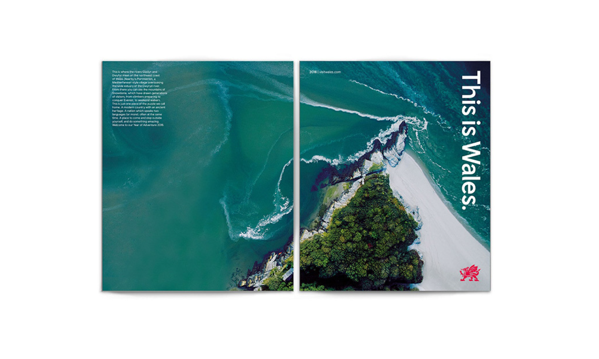
A simple yet striking emblem that represents and reflects the true Welsh dragon. Their task was to create something inherently welsh with a global outlook, to create a symbol that shows confidence yet stays unpretentious. A brand that is ‘of the country’, a mark that invites tourists into the country as well as giving a reason to proud of the Welsh name.
Many people don’t see the value of investing time or money into branding, especially when it comes to country brands. The ability of design to increase tourism is massively overlooked. Many individuals prefer to see funds spent on other avenues. Because of this, the project was soft launched in 2016, as part of the Wales Year of Adventure tourism campaign. Many do not realise the true financial value benefit of the rebrand, Visit Wales claims it has generated an extra £370m for the welsh economy, this is an 18% increase on the previous year. Visit Wales also reported an increase in overseas visitors by 12% for the first 9 months of 2016. Since the new identity, there has been an increase of ‘visit wales’ social media followers by 30%. 5 million unique visitors to check out the Visit Wales website.
North Wales has now been featured in Lonely Planet’s guide of ‘Top Locations in the World’ to visit this year.
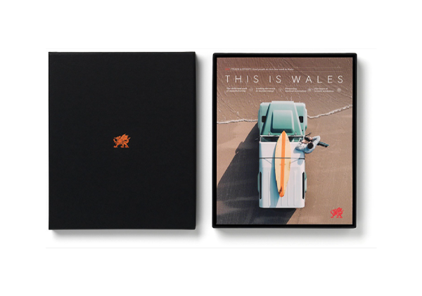
It wasn’t only time and money that contributed to the project, it was the thought and passion. The attention to detail to get the best outcome. A 6 month process, a journey to capture wales in just one symbol. 500 versions of the dragon were created before achieving the final design, starting by looking at illustrations of dragons that were already established, this was narrowed down to focus on the strongest versions. They wanted to come up with a strong statement that didn’t particularly need the type next to it.
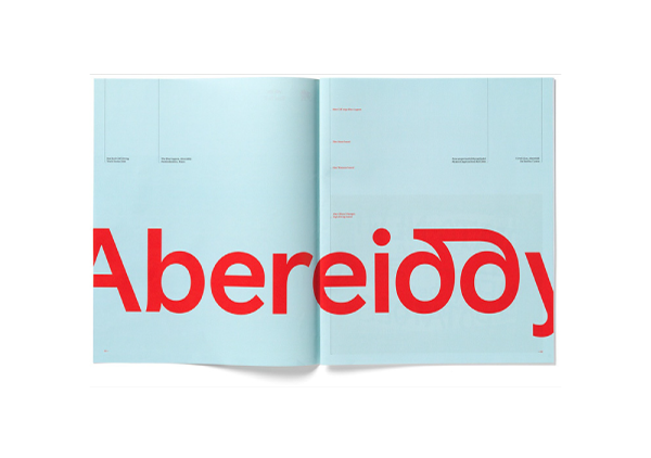
A new sans-serif type face was created with type foundry, named Colophon. It incorporates glyphs that are unique only in the welsh language. It is segmented into different ‘levels’ if you will. So a simple, more neutral form without the glyphs has developed, this is more for business applications etc. And the other has more ‘personality’, which does include the glyphs, this will be used more for tourism purposes. Smorgasbord’s photographers’ captured Wales, taking shots of the urban and rural landscape. They then had their designers colour pick the shades from the various images, this is how the new colour palette was curated, naming the new colours after Welsh places. This just simply ties the whole thing together and makes it a thing of beauty.
Having a whole team of people behind a project like this is crucial. To create the right concepts and open ideas makes the process a lot better. The team have manage to surprise and inspire people with this new mark. Find airport car service. It has reinforced positive perceptions of Wales. Investing in ‘Place Branding’ can bring a lot of benefits, it’s more than just aesthetics, yes it has to look and feel good, but it needs to deliver.
Deliver they have done, and done well at that.