
Premier League: The New Look
A new bold, vibrant and clean face lift. The Premier League have had a shake up on their brand identity, and it has for sure paid off. Design Studio and Robin Brand Consultants have come together to create the face of the legendary lion. Their task was to create something that is relevant, modern and flexible, we believe they’ve achieved all three of these things. Unlike before, it is now purpose built for demands of the modern world, but it remains true to Premier League’s history and heritage.
The redesign was never about destroying everything that was there to building something new, it was about building on the equity & legacy and making it stronger. A number of elements from the old logo have been removed including the football and the Barclays Bank branding, doing this allowed the new logo to become minimal and more of a stripped back form of what was.
There was and still is a lot of pressure on Design Studio to get the new identity spot on. Research shows that many have a positive view about the game but a negative view on the business, so the ultimate aim for the new brand identity is to give a positive opportunity and hopefully change the opinion of those with a negative view.
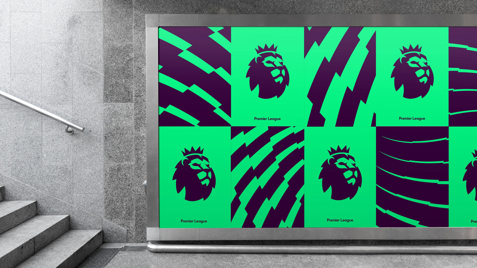
One thing the new logo had to be was, adaptable. Being on 212 territories, visual identity on stadiums, advertising, uniforms, merchandise, game tickets, broadcast graphics and 1 billion nike footballs, I think it’s safe to say that it would make complete sense to allow the logo to adapt and be flexible depending on where it’s being applied. A “kit of parts” of different sizes, different colours and changes in text were created. This was all something that the old logo never had implied in their design.
It took 600 iterations to get to the final decision. A long process, going through many different stages to get to the outcome. They wanted to create something that was instantly recognisable as well as being it’s own. Stuart Watson from Design Studio said, “make it work as an app icons and worry about everything else after”, so they’ve done just that. The identity has gone from being a formal, buttoned up, shirt and tie & slightly reserved look to an approachable, warm and more human look.
To create a more personal font, Design Studio have created a bespoke word mark so that the words, Premier and League can be stacked nicely when being used. But it’s not just the font that has been chosen well, the colours too. They have deliberately gone away from any colours that relate to specific clubs, so the colours are completely their own. They had to pick colours that, as well as they logo design, were adaptable. Colours that could be used for formal formats as well as being used for light hearted communications. When creating a brand identity, it is vital to think about the audience and who it’s going to be seen by, who you want to attract, so the colours had to suit everyone ranging from a 6 year old child to a 60 year old politician.
Premier League decided to celebrate and promote the rebrand by releasing a new film, highlighting the nature of football today. The video shows footage of community projects, as well as Premier League matches. There was a recent protest over rising ticket prices, and many feel they are priced out of games at their home clubs. Despite all of this, Premier League remains the most watched in the world, and is the football league that generates the world’s highest revenue.
From a brand perspective, there has been a big change in how the business feels. It now has a more human feel to it, an identity that’s approachable. The desire is to capture the human stories around the premier league. They want to start showcasing grassroots projects as well as the League’s work that it has done in the local communities. The new look could potentially open up new sponsors in the future, hoping to get away from booze, banks and betting and working more with social and forward thinking business.
I think it’s safe to say it’s going to be interesting to see what the future holds with the possibilities and avenues could take Premier League with it’s more caring, friendlier face.